User experience design makes or breaks B2B Ecommerce success. While poor Shopify UX design might cost you a single retail sale, in the B2B context, it can mean losing accounts worth thousands or even millions in annual revenue.
In this comprehensive guide, you’ll master the foundational UX principles that drive B2B success on Shopify, discover design best practices for product pages and checkout flows optimized for wholesale buyers, learn how to balance complexity with usability, explore emerging trends in wholesale pricing UX and self-service automation, and see real-world examples of B2B stores that converted UX improvements into measurable business growth.
Fundamental UX Principles for Shopify B2B
B2B UX presents unique challenges that don’t exist in consumer Ecommerce. Business buyers need to manage complex approval workflows, navigate extensive product catalogs with thousands of SKUs, process bulk orders efficiently, and access negotiated pricing terms specific to their company. They’re working under time pressure, often managing multiple supplier relationships simultaneously, and expect professional, streamlined experiences that respect the complexity of their purchasing requirements.

Yet many Shopify merchants approach B2B UX as an afterthought – applying consumer-focused design patterns to wholesale operations and wondering why conversion rates disappoint. The truth is that effective B2B UX design requires fundamentally different thinking about user needs, workflows, and success metrics.
Successful B2B UX design starts with understanding the core principles that differentiate business buyer needs from consumer shopping behaviors. These foundational concepts should inform every design decision in your wholesale storefront.
Transform your B2B store with B2Bridge.
Discover how B2Bridge can transform your wholesale business.
Schedule a demo today to see our payment management tools in action.
Intuitive Navigation and Categorization
Business buyers operate under time constraints that consumer shoppers don’t face. A retail customer browsing for leisure can tolerate exploratory navigation and discovery-focused layouts. A purchasing manager responsible for reordering supplies for their business needs to find specific products quickly, compare options efficiently, and complete transactions without friction.
Your navigation architecture must reflect how B2B buyers think about and search for products. This often means organizing products by function, industry application, or technical specifications rather than consumer-friendly lifestyle categories. A buyer looking for industrial fasteners needs to filter by thread size, material grade, and finish – not browse through “Featured Products” or “Trending Now.”
Navigation best practices for Shopify B2B stores:
- Advanced filtering capabilities: Implement multi-dimensional filtering that lets buyers narrow results by multiple technical specifications simultaneously – material type, size range, compatibility, certification standards, and availability
- Robust search functionality: Deploy search that understands SKU numbers, manufacturer part numbers, and industry terminology, returning accurate results even with partial or variant spelling
- Breadcrumb trails: Always show users where they are in your catalog hierarchy and provide easy paths back to broader categories without losing their filtering context
- Quick access to account-specific information: Surface recently ordered products, saved lists, and contract items prominently so buyers can reorder without navigating through your full catalog
- Predictive search: Use autocomplete and search suggestions that learn from past behavior, helping buyers find products faster with each visit
- Bulk action capabilities: Enable selecting multiple products from search or category results for simultaneous comparison, list creation, or cart addition
The goal is eliminating navigation as a barrier to purchase. When buyers can find what they need in seconds rather than minutes, conversion rates and average order values increase dramatically.
Minimized Friction in Key B2B Actions
Every click, form field, and page load between intent and transaction represents potential abandonment. B2B buyers value efficiency above almost everything else – they’re often processing multiple orders across multiple suppliers in a single session.
Identify the most common B2B actions in your wholesale operation and streamline them relentlessly. Quick reordering of previously purchased items should take seconds, not minutes. Requesting quotes for custom orders shouldn’t require email exchanges. Bulk ordering hundreds of SKUs must be simpler than adding items one-by-one.
Features that minimize B2B friction:
- Quick order forms: Provide spreadsheet-like interfaces where buyers can enter multiple SKU numbers and quantities rapidly, then add everything to cart with one action
- CSV upload support: Allow buyers to upload order lists from their procurement systems directly, automatically matching SKUs and adding quantities to cart
- Saved product lists: Enable creation of custom lists organized by project, department, or reorder schedule – buyers maintain their own catalog subsets for instant access
- One-click reordering: Display order history with single-click reorder buttons that add entire past orders to cart for review and modification
- Quote request workflows: Implement streamlined quote requests that capture requirements without forcing buyers into email communication or phone calls
- Bulk actions everywhere: Whether in cart, product lists, or search results, allow selection and actions on multiple items simultaneously
According to recent B2B Ecommerce research, buyers who can complete orders in under 5 minutes have 40% higher repeat purchase rates than those facing longer, more complex ordering processes. This data underscores why friction reduction should be your primary UX optimization focus.
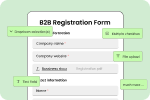
Personalized Account Experiences
Unlike consumer Ecommerce where personalization often means product recommendations, B2B personalization centers on displaying contract-specific information, negotiated terms, and company-specific pricing that professional buyers expect to see automatically upon login.
When a wholesale buyer logs into your Shopify B2B store, they should immediately see their world – their negotiated prices, their payment terms, their order history, their saved lists, and products relevant to their industry or past purchases. Generic experiences that fail to acknowledge the buyer relationship create frustration and erode trust.
Elements of effective B2B account personalization:
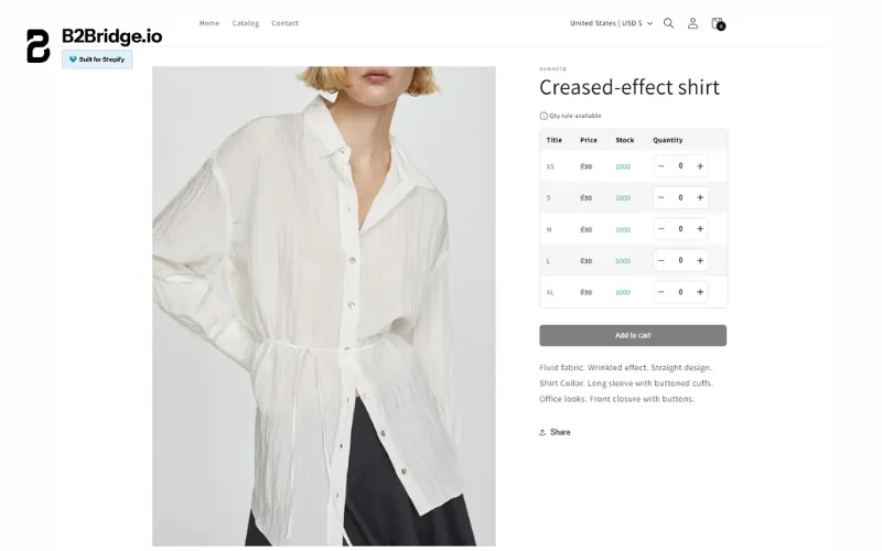
- Negotiated pricing visibility: Display the buyer’s specific pricing on every product page and in all catalog views – no surprises at checkout about what they’ll actually pay
- Net payment terms prominence: Show available payment options including Net 30, Net 60, or Net 90 terms clearly in account dashboards and during checkout
- Approval workflow integration: For buyers requiring internal approvals, surface pending orders, approval status, and assigned approver information within their account portal
- Credit limit transparency: Display available credit, current outstanding balance, and payment due dates so buyers understand their purchasing capacity
- Account-specific catalogs: Show only products the buyer’s company has access to based on contracts, geography, or relationship tier
- Assigned representative information: Feature the buyer’s dedicated sales rep, account manager, or customer service contact with direct communication options
- Company hierarchy management: For buyers managing multiple locations or departments, provide easy switching between entities with appropriate pricing and terms for each
Personalization at this level requires integration between your Shopify storefront and backend systems managing customer data, contracts, and financial terms. Apps like B2Bridge facilitate these connections, ensuring buyers see accurate, relevant information from their first login.
Optimizing Product and Checkout Pages for B2B
While navigation gets buyers to products and account features support the relationship, product pages and checkout flows are where transactions happen. Optimizing these critical conversion points requires understanding what information B2B buyers need to make confident purchasing decisions.
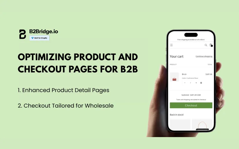
Enhanced Product Detail Pages
B2B product pages serve a fundamentally different purpose than retail pages. Consumer shoppers need emotional connection – lifestyle imagery, reviews, social proof, and brand storytelling. Business buyers need facts – technical specifications, availability data, documentation, and compatibility information.
Your product detail pages must balance comprehensive information with scannable layouts. Buyers shouldn’t need to scroll through aspirational copy to find load capacity ratings or download product certifications. Technical information should be prominent, organized logically, and available in formats buyers can share with stakeholders or reference later.
Best practices for B2B product detail pages:
- Prominent technical specifications: Display detailed specs above the fold in structured, scannable formats – tables work better than paragraphs for technical data
- Real-time inventory visibility: Show actual stock levels (not just “in stock” vs “out of stock”) so buyers can make informed decisions about order quantities and timing
- Lead time transparency: Clearly communicate shipping timelines, especially for made-to-order or special-order items where delivery windows impact buyer planning
- Downloadable documentation: Provide easy access to spec sheets, CAD files, safety data sheets (SDS), certificates of compliance, installation guides, and warranty information
- Related and complementary products: Suggest compatible items, required accessories, or commonly purchased together products that help buyers complete their requirements
- Volume pricing tables: Display tiered pricing clearly so buyers understand discounts available at different quantity breakpoints
- Alternative and substitute products: When items are low stock or discontinued, suggest alternatives with comparison information
- Multiple product images: Show products from various angles, in use applications, and detail shots of critical features – B2B buyers often can’t inspect products physically before ordering
- SKU and part number prominence: Display manufacturer part numbers, your SKU, and any alternate identifiers prominently for easy reference and reordering
Consider adding a “Quick Info” section that consolidates the most critical B2B information – current price for this buyer, lead time, minimum order quantity, and available stock – in one scannable block. This respects the buyer’s time while ensuring they have decision-making information immediately.
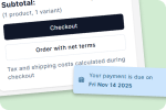
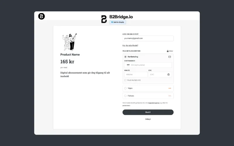
Checkout Tailored for Wholesale
The checkout experience makes or breaks B2B conversion. Complex requirements around shipping, payment terms, purchase orders, and approvals mean that applying standard consumer checkout patterns to B2B transactions creates frustration and abandonment.
B2B checkout must support workflows that don’t exist in retail: shipping split orders to multiple locations, recording purchase order numbers for reconciliation, selecting from company-approved payment terms, and routing orders through approval chains before finalization.
Wholesale checkout optimization strategies:
- Multiple shipping address support: Allow buyers to split orders across multiple locations within their company without creating separate orders – common for distributors and multi-location businesses
- Purchase order number capture: Provide prominent fields for PO numbers, project codes, or other reference information buyers need for internal tracking and reconciliation
- Flexible payment terms display: Show all available payment options including Net 30, Net 60, Net 90 terms with clear explanations of due dates and any associated terms
- Saved shipping and billing addresses: Remember company locations and financial contacts to speed repeat checkouts – B2B buyers reorder frequently from the same addresses
- Order notes and special instructions: Provide ample space for delivery instructions, packaging requirements, or other order-specific information
- Cart editing without starting over: Allow quantity changes, item removal, and cart modifications without forcing buyers back through previous checkout steps
- Order summary clarity: Display order totals with clear breakdown of product costs, shipping, taxes, and any fees or discounts – transparency builds trust
- Approval workflow integration: For buyers requiring managerial approval, clearly explain what happens after order submission and provide tracking of approval status
- Save for later functionality: Enable buyers to save carts for completion later – useful when gathering additional requirements or waiting for approval
- Guest checkout elimination: For B2B, require account login before checkout to ensure proper pricing, terms, and account linking – guest checkout makes no sense in negotiated pricing contexts
The checkout process should feel professional and accommodate business purchasing requirements without becoming cumbersome. Test your checkout flow with actual wholesale buyers to identify friction points that may not be obvious from internal testing.
Mobile Usability and Performance Optimization
Mobile devices now account for over 60% of B2B research and an increasing percentage of actual transactions. The assumption that business buyers only purchase from desktop computers no longer holds – purchasing managers use smartphones and tablets throughout their workday to check availability, place reorders, and research suppliers.
Yet mobile UX for B2B requires different considerations than consumer mobile commerce. Business buyers on mobile devices often need to reference multiple information sources simultaneously, may be working in environments where laptop use is impractical (warehouses, job sites, retail floors), and still require access to the same complex functionality as desktop users.
Mobile-first B2B design principles:
- Responsive layouts that truly work: Don’t just shrink desktop layouts – redesign navigation, product displays, and checkout flows specifically for smaller screens while maintaining full functionality
- Touch-optimized interfaces: Size buttons and interactive elements for finger taps rather than mouse clicks, with adequate spacing to prevent accidental selections
- Simplified navigation patterns: Use bottom navigation bars, hamburger menus, and sticky headers that work with one-handed mobile usage
- Progressive disclosure: Show essential information immediately while making detailed specs, documentation, and secondary content available through expand/collapse patterns
- Fast-loading product images: Optimize images for mobile bandwidth without sacrificing quality needed to evaluate products
- Mobile-friendly forms: Use appropriate input types (numeric keyboards for quantities, email keyboards for email fields) and minimize typing required
- Persistent cart access: Keep cart easily accessible from all pages so buyers can quickly review and modify orders without navigating back to cart page
Performance optimization for B2B:
Page speed impacts conversion rates even more dramatically in B2B contexts than retail. Professional buyers value their time highly and have multiple supplier alternatives – slow-loading pages lead to immediate abandonment.
- Image optimization: Compress product images, use modern formats like WebP, and implement lazy loading for images below the fold
- Code efficiency: Minimize JavaScript, eliminate unused CSS, and reduce third-party script bloat that slows page rendering
- Server response optimization: Use Shopify’s CDN effectively, implement caching strategies, and optimize database queries for faster data retrieval
- Mobile-specific optimization: Serve appropriately sized images to mobile devices and prioritize critical rendering path for above-the-fold content
- Regular performance audits: Use tools like Google PageSpeed Insights, Lighthouse, and WebPageTest to identify and address performance bottlenecks
Accessibility compliance:
Professional buyers include users with diverse abilities who need accessible interfaces. Beyond being the right thing to do, accessibility compliance expands your addressable market and often improves UX for all users.
- Keyboard navigation support: Ensure all interactive elements can be accessed and activated via keyboard alone for users who cannot use mice
- Screen reader compatibility: Use semantic HTML, proper heading hierarchy, and ARIA labels so screen readers can interpret page content and functionality
- Color contrast standards: Meet WCAG AA standards for text contrast to ensure readability for users with visual impairments
- Alternative text for images: Provide descriptive alt text for product images and functional images like icons
- Form label associations: Properly label all form fields so assistive technologies can identify field purposes
- Error messaging clarity: Display form validation errors in multiple ways (not just color) and provide clear guidance for correction
Accessibility and performance optimization aren’t just compliance exercises – they directly impact conversion rates, customer satisfaction, and the breadth of your addressable wholesale market.
Emerging Trends in B2B UX and Wholesale Pricing
The B2B Ecommerce landscape continues evolving rapidly, with several key trends reshaping expectations for Shopify UX design in 2026 and beyond.
Personalized Wholesale Pricing Experiences
Generic pricing displays are becoming obsolete in competitive B2B markets. Modern buyers expect pricing personalized to their relationship, purchase history, and negotiated terms – visible automatically throughout their shopping experience without requiring quotes or sales rep interaction.
Dynamic pricing as a UX feature: Rather than static price lists, sophisticated B2B stores implement pricing that adjusts based on real-time factors – quantity selected, buyer’s order history, current inventory levels, and payment term selection. The UX challenge is making these dynamic adjustments transparent and understandable rather than seeming arbitrary or confusing.
Display pricing that responds to buyer actions: “Select 50+ units to unlock volume pricing” or “Net 30 terms available – see adjusted pricing at checkout.” This transparency helps buyers optimize their orders for best value while understanding the factors influencing pricing.
Tiered discount visibility: Show buyers where they stand in your pricing tiers and what they need to do to reach the next level. “You’re $500 away from Platinum tier pricing” creates clear incentives for larger orders while making pricing logic transparent.
Visibility controls as competitive advantage: Protecting wholesale pricing from unauthorized viewers isn’t just about security – it’s about creating exclusive experiences for approved buyers. When wholesale customers log in to see pricing not available to the public, it reinforces the value of their business relationship with you.
Modern B2B UX design treats pricing as a dynamic, personalized element of the experience rather than static numbers on product pages. This requires sophisticated backend systems but delivers measurable improvements in conversion and average order values.
Advanced Self-Service and Automation
B2B buyers increasingly expect self-service capabilities that previously required sales rep assistance. The UX trend is toward portals and automated workflows that give buyers control over their accounts, orders, and information without creating support tickets or making phone calls.
Comprehensive account portals: Modern B2B buyers expect to manage their entire relationship through intuitive portals – viewing order history, downloading invoices, tracking shipments, updating payment methods, managing users, and modifying company information without contacting customer service.
The UX challenge is organizing these capabilities intuitively so buyers can find what they need without feeling overwhelmed by options. Use logical grouping, clear navigation, and progressive disclosure to keep portals manageable even as functionality expands.
Automated order workflows: Implement automation that handles routine tasks buyers previously needed help with – automatic reorder reminders based on purchase patterns, subscription orders for consumable products, and approval routing for orders exceeding authorization thresholds.
From a UX perspective, automation should feel helpful rather than rigid. Provide overrides and manual options so buyers maintain control while benefiting from efficiency.
Real-time order management: Enable buyers to modify, cancel, or supplement orders in real-time before they enter fulfillment – no more calling customer service to change shipping addresses or add forgotten items.
Self-service support resources: Embed contextual help, video tutorials, and documentation directly in your UX where buyers need it. Rather than generic FAQ pages, provide specific guidance within relevant workflows – how to upload CSV orders on the quick order form page, how payment terms work on the checkout page.
These self-service trends reflect broader B2B buyer expectations for digital experiences matching the convenience of consumer Ecommerce while accommodating business purchasing complexity.
B2Bridge: Enhance Your Shopify B2B UX
Outstanding UX design requires more than visual polish – it demands sophisticated functionality that supports complex B2B workflows. B2Bridge provides a comprehensive toolset that transforms standard Shopify stores into professional wholesale platforms with UX that business buyers value.
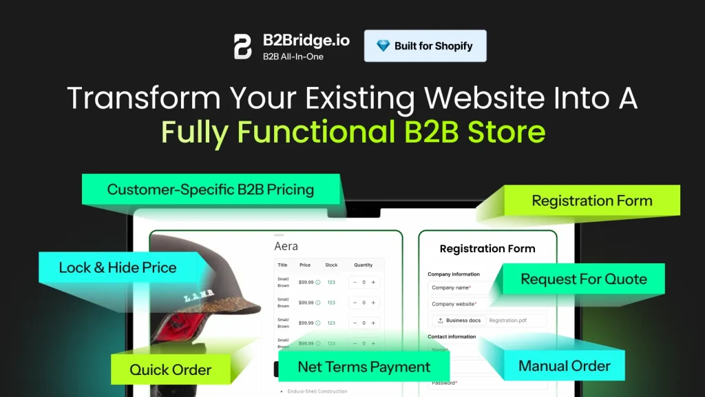
Run B2B as easily as B2C with B2Bridge’s all-in-one wholesale tools designed specifically for the complex workflows that B2B UX must accommodate – bulk ordering, approval processes, and account management features built directly into your Shopify storefront.
Protect your pricing with sophisticated visibility controls that hide wholesale prices from retail shoppers and ensure the right customers see their negotiated rates automatically – eliminating pricing confusion and protecting your margin structure.
Scale with confidence as B2Bridge grows with your wholesale operation, handling increasing customer counts, expanding product catalogs, and complex pricing structures without requiring messy spreadsheets or manual work that creates UX bottlenecks.
Save time on operations by automating registration workflows, price list assignments, and order handling so your team can focus on strategy rather than administrative tasks – automation that works invisibly behind great UX.
Offer a seamless buyer experience with self-serve shopping journeys, quick reorder capabilities, account portals, and streamlined checkout that meets professional purchasing expectations while feeling as smooth as consumer Ecommerce.
Close more wholesale deals with built-in quote management, negotiation tools, and flexible payment terms including Net 30, Net 60, and Net 90 options that remove friction from the buying process – functionality that enhances UX by supporting real business needs.
Future-proof your store with B2Bridge’s app that adapts as your wholesale grows, adding capabilities without requiring multiple apps or complex integrations that fragment the user experience and create maintenance challenges.
Shopify UX Design For B2B Stores: Case Studies
Industrial Supplies Distributor Transformation
A mid-sized industrial supplies distributor serving manufacturing and construction companies struggled with low online adoption despite having a Shopify Plus B2B store. Analysis revealed their UX design treated wholesale buyers like retail consumers – products organized by broad categories, minimal technical specifications, and no support for bulk ordering.
They redesigned their Shopify UX design around buyer workflows. They implemented advanced filtering by technical specifications (thread size, material grade, load capacity), added quick order forms accepting SKU lists, enabled CSV upload for bulk orders, and created detailed product pages with downloadable spec sheets and certifications.
The results were dramatic: online order volume increased 240% in six months, average order value grew 35%, and customer service inquiries about product specifications dropped 60%. Buyers reported that the new UX matched or exceeded the convenience of placing orders through sales reps while giving them more control over research and ordering timing.
Fashion Brand Wholesale Portal Success
An emerging fashion brand with strong DTC sales wanted to expand into wholesale without degrading their consumer brand experience. They created a separate B2B portal with entirely different UX optimized for boutique buyers and retail partners.
The wholesale portal emphasized efficiency – buyers could quickly browse seasonal collections, view line sheets, place orders by style number with multiple size/color selections, and see their negotiated pricing instantly. They added features specifically requested by wholesale customers: minimum order quantity visibility, delivery date estimation, and saved order templates for recurring seasonal purchases.
Within the first year, wholesale revenue reached 40% of total sales. Boutique buyers praised the professional portal design, with 85% reporting the ordering experience was better than competitors. The brand attributed success partially to recognizing that B2B buyers needed entirely different UX than consumers, designing specifically for wholesale workflows rather than adapting their retail storefront.
FAQs about Shopify UX Design For B2B Stores
B2B UX prioritizes efficiency, functionality, and accommodation of complex workflows over the emotional engagement and discovery focus of B2C design. Business buyers need quick access to technical information, bulk ordering capabilities, account-specific pricing, and features supporting approval processes and multiple shipping addresses. Consumer UX emphasizes inspiration, lifestyle imagery, social proof, and impulse purchases.
B2B navigation organizes products by technical specifications and function, while B2C navigation uses aspirational categories and featured collections. The fundamental difference is that B2B buyers know what they need and want to complete transactions quickly, while consumers often shop for enjoyment and discovery.
Accessibility expands your addressable market to include professional buyers with disabilities – a significant population that federal and state regulations increasingly protect. Beyond compliance, accessible design often improves UX for all users through clearer navigation, better-structured content, and more logical information hierarchy.
Features like keyboard navigation help power users work more efficiently, high-contrast design improves readability in various lighting conditions, and clear form labeling reduces errors for everyone. In B2B contexts where account values can reach millions of dollars, accessibility barriers that exclude even a small percentage of potential buyers represent substantial lost revenue.
The most damaging mistake is applying consumer shopping patterns to business buying – excessive lifestyle imagery without technical specifications, hiding bulk order capabilities, making buyers add items one-by-one rather than supporting CSV uploads, or requiring too many clicks to reorder previously purchased products.
Other common errors include failing to display negotiated pricing automatically, forcing buyers through approval workflows designed for retail, hiding account management features behind poor navigation, providing insufficient product information for confident purchasing decisions, and neglecting mobile optimization under the assumption B2B buyers only use desktops. Additionally, many merchants overlook the importance of performance – slow-loading pages frustrate time-sensitive business buyers more acutely than leisure shoppers.
Personalized pricing must display automatically based on customer login without requiring buyers to request quotes or contact sales for their rates. Show the buyer’s specific price on product pages, category views, search results, and cart – everywhere pricing appears. Make volume discounts and tiered pricing visible through clear tables showing price breaks at different quantities.
When pricing varies based on factors like payment terms or order size, explain these variables transparently so buyers understand how to optimize their orders. Use conditional logic to hide wholesale pricing from logged-out visitors and retail customers, ensuring only authorized buyers see negotiated rates. Apps like B2Bridge automate this personalization, applying appropriate pricing based on customer attributes without requiring custom development.
Conclusion
Exceptional Shopify UX design for B2B stores isn’t about beautiful aesthetics – it’s about deeply understanding how business buyers work and designing experiences that support their complex requirements while maintaining the simplicity and efficiency they value.
Most importantly, effective B2B UX design requires the right tools. Shopify provides the foundation, but apps like B2Bridge deliver the specialized functionality that transforms good intentions into exceptional buyer experiences.
Ready to transform your Shopify B2B UX design? Discover how B2Bridge delivers the functionality and automation that makes professional buyer experiences possible without custom development complexity. Explore B2Bridge today and give your wholesale customers the UX they expect from modern B2B platforms.

Hi, I’m Ha My Phan – an ever-curious digital marketer crafting growth strategies for Shopify apps since 2018. I blend language, logic, and user insight to make things convert. Strategy is my second nature. Learning is my habit. And building things that actually work for people? That’s my favorite kind of win.